I built my own Bear Blog theme
Two weeks ago I finally decided to design my blog’s theme once and for all, and what you’re looking at right now is the (almost) final version. I postponed this for over a year for different reasons, but mostly because I felt very rusty when it came to CSS. It’s something I learned in a crash course a few years ago and purely as a hobby, so it’s a skill I don’t practice often.
The point is: this is the first time I’ve developed a theme for a blog, and surprisingly it’s been one of the most fun and rewarding things I’ve done so far this year. Today I want to talk about my theme and what makes it special.
Design philosophy
The main thing I wanted to achieve with this theme was for each post to feel like an editorial publication. A large part of the design effort is focused on the reading experience itself. The spacing between letters, paragraphs, photos, and headings (among other elements) was carefully measured to provide a comfortable reading experience, one that prevents eye strain or losing your place between lines.
At the same time, I didn’t want to achieve that without the theme feeling extremely personal. I wanted to design something that included elements representing me, not as a blogger or writer, but as a person. That’s why the details decorating the site include characters like the Pisces symbol, spirals, and cats.
Also, despite the possibilities CSS offers, I always knew I wanted a design that respected the functionality and structure of an old-school personal blog, avoiding scripts and other fancy elements that could complicate development, loading times, or navigation overall.
Colors and fonts
I wanted to use two of my favorite colors as the main base: navy blue and salmon. Interestingly, this is a combination that works very well in fashion but is rarely stylized. Within the blog, salmon is used to highlight important elements, including the main title and links; navy blue works as the primary base for the dark theme and also highlights headings and navigation in the light theme.
For the light theme background, I chose a cream color that gives off a rustic paper feel, helping reinforce the editorial vibe and pairing nicely with the main colors. It’s funny because the main theme is actually the dark one—it’s the one I designed first—but in the end I think I like the light mode more, or maybe I just need to grow more attached to it.
Other tones or variations of the main colors decorate parts of the main area. For example, purple is used for visited links, while alternate shades of salmon or blue are used to style post lists depending on the viewing mode.
As for fonts, there isn’t much to say, but I did want a modern feeling. The theme is basically composed of three main typefaces:
- Helvetica Neue (Helvetica, Arial fallback) — Used for paragraphs, captions, footnotes, buttons, and most of the main content.
- System UI stack (-apple-system, Segoe UI, Roboto, etc.) — Used in headings and navigation menus.
- Abril Fatface — Present in the blog title and in the footer, specifically in the “THANK YOU FOR READING”.
Photos
Usually, photos or any other graphic elements tend to be crucial in blog entries where they appear, mainly because I don’t include them very often (although I’d like to create posts where photos are the main focus). Because of that, I didn’t want them to be overly distinctive with borders or hover animations.
To make them stand out, photos only have a subtle shadow underneath, giving them a very light sense of depth that’s more noticeable in the light theme. Additionally, photo captions have a different shade of salmon as a background to highlight the text.
Post lists and general navigation
Unlike photos, I did want post lists to have a more distinctive style. That’s why they feature a subtle animation, borders to make them more aesthetic, and a background that, once again, uses a variant of blue or salmon depending on the case. These are, to be honest, simple tweaks that enhance the visibility.
Regarding the navbar, I wanted its personality to be very subtle. It’s centered, with borders and spacing that give breathing room to each of the blog’s main pages. It’s likely that more pages will be added at some point, but to avoid cluttering the main navigation, I included an extra bar in the footer.
At the very bottom of the blog are the options to subscribe via RSS or email, along with space for future pages I might add. This area is more about me or things related to the blog itself.
Other notable features
- As mentioned throughout the post, the theme includes both dark and light versions. It automatically adjusts depending on the system preferences of whoever visits the blog.1
- It’s responsive! All key elements like the title, navbar, and footer adapt to smaller dimensions, improving the blog’s appearance on mobile devices.
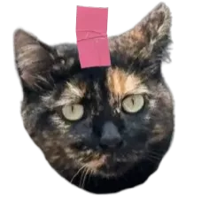
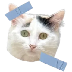
- Thanks to Bear Blog allowing header customization, my theme includes the option to add and style images in that block (right now you’re seeing my cats).
- Within post bodies, the theme includes a button to reply via email and, of course, a toast button—both customized.
- It also has a menu to navigate to the previous and next post, but this is added and edited manually using Markdown because I couldn’t find a way to automate it and I doubt it’s possible.2
- Footnotes were also redesigned following the editorial philosophy, with discreet font size, opacity, and placement at the end of the post.
“Can I steal your CSS?” and what’s next
YES.
The next step for this theme is refining the CSS and trying to make it as intuitive as possible, since all of its elements can be edited to suit whoever wants to use it. After that, my idea is to share the code with the community, but I’m still not sure what the best way to do that is, since some things work in conjunction with Markdown inside posts, the footer, and the head.
If you’re reading this and have any recommendations about best practices for releasing a theme out into the world, I’d appreciate it if you shared them with me. For now, if there’s something you like about the theme, feel free to take it by inspecting the CSS.3
In conclusion: this is a theme made for anyone who wants a modern layout focused on words and how they look and read within the blog. Its navigation is simple, but the color combinations make it feel fresh.
Now I really want to create another theme because this was a super fun project that absorbed me for days (in a good way). Designing and editing the code put me “in the zone”, and hours went by like nothing; a feeling I hadn’t experienced in a long time.
Hopefully this motivates others to give personality to their blogs.